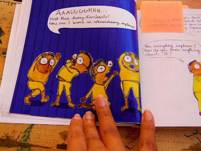
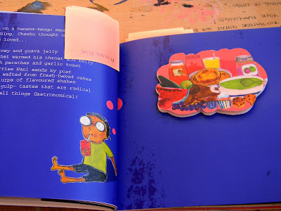
Luckily thanks to various pushes from my review panel members I printed my first draft yesterday... only to find about a 100 mistakes and changes to be made.
First thing the size, having asked about the print area on a regular Digital printing sheet I calculated that making the page size 6 by 6 inches would give me minimum wastage. I was misinformed and it turns out that the page size should be 5.8 by 5.8 inches to get 6 spreads in one sheet.
Second the grid. The inside margin was too narrow which I found after binding as a lot of the images were getting lost in the fold.
The hand written type for all the dialogue was a bit too small in some pages and I am reconsidering using it as it is a children’s book and the typography has to be very clear, simple and legible.
The blues didn’t come out as I expected and Nupur had mentioned this to me. For the next print I will have to re-check all the background colours and a few of the illustration colours with a colour value book. Cheeku looks like he has jaundice in a few spreads. The colour blue feels a little over powering; I am reconsidering the use of such a strong colour in so many pages.
The flaps should also be better utilised. I spent a lot of time editing the text that would come in them but there are two side to the flap and using both makes more sense in terms of the information I can give as well as visually.
One of the main pull outs came out upside down and I will have to adjust most of my flaps.
There are a lot of changes that I need to make and I suppose better now than later. Will have more inputs from my review panel next week.
In the mean time, I’m going to start working on the collaterals.
· A twin set of tote bags
· A twin set of aprons
· A set of 6 table mats


Pushpi...
ReplyDeleteI had a huge smile when I went through this post.
The book looks really nice and I want to hold it and see the illustrations myself.
Its good that you went to print out the dummy so now you actually know the mistakes.
For the body type, have you considered using fonts available specially for children books (I stumbled upon some websites mentioning it)
Its a good idea to issue a color value book and recheck your colors as you ARE using a wide palette.
HOW can you call this a disaster?!
ReplyDeletei agree with sharvari..its looking really good..and you have more than enough time for changes and finishing touches now :)
good luck!
<3
since you are almost done, do you want to help me with mine? hehe...
ReplyDeleteyou are absolutely the coolest person EVER!
and I love the book by the way!
hey pushpi went through ur blog after ages...very pleasing and a lot of work has gone into it...looks good i like the bright colours and the illustrations that are totally apt for the audience...Very you :) waiting t see the collaterals now. all the best
ReplyDelete