Wednesday, September 29, 2010

Review 5

Feedback on the Narrative (overall):

·         Re think the cover type- Garrulous Gastronaut should be the highlight. You don’t need to include “by” Pushpi Bagchi- Just your name is fine. As you are mentioning one Gastronaut “The...” it would make more semantic sense to have just one illustration of the main character on the cover.
·         Keep the typography in the inside pages simple and make it bigger in size.
·         Overall the layouts don’t have a relief of contrast, there is too much happening and the flow is a little monotonous. Perhaps create a pattern of contrasting pages using illustration, colour, type, etc.
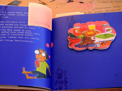
·         Rethink the shapes of a few of the flaps as at the moment most are simple shapes- squares, rectangles, etc. Perhaps they can be in the shape of food? Also the type size under the flaps can be smaller as it is like revealing a secret underneath.
·         Edit the copy. It’s too lengthy.
·         Can increase the size of the book.
·         Also consider making the cover hard bound while getting the book bound.

Friday, September 24, 2010

Material Scouting

I initially thought I would buy my materials from Commercial Street and get them stitched some place in Yelahanka. However after speaking to Meera she told me about Chindi Market in R C Puram where you can buy canvas and other materials to make bags etc at lower prices and find tailors that will have the right  skills to stitch bags, mats etc. She drew me a map that I later refined and have also looked up the place on Google maps, hopefully I find this place easily!

Meera's Map:


On Google maps:


View Larger Map

The Gastronaut's Kit

For all the products I want to use a common material that is durable, inexpensive, and washable.  I looked at the shopping bags that my parents currently use when they go to the farmers market.


Jute was out as the fibres tend to wear easily while carrying heavy weights and the texture isn’t very child friendly as it is coarse and “itchy”.


The bag below was featured in Etsy.com


The synthetic blue bag is something that has been around for forever. It is extremely durable, doesn’t get dirty easily and the material comes in bright colours. However it is uncomfortable to carry as the straps cut into the palm when the bag gets full.

The canvas bag is an easy favourite as it is durable, very comfortable to carry, washable and stretchable for when you’re trying to cram in a lot of shopping. The natural off white colour of the material offsets bright printing inks well and it is also not expensive. The material used for the straps thought synthetic doesn’t cut into the shoulders or palm white carrying heavy weights and makes the bag a lot more durable.
Canvas can also be used for aprons and the table mats.
I also want the child’s tote bag to double up as the packaging for the entire kit containing the book, adult tote bag, twin set of aprons and 6 table mats. This would need the bag to me somewhat sealable for the packaging and for when a child uses the bag in a market to avoid accidents where the contents spill out on the ground in case the bag slips off their shoulders. When I’d visited the Montessori School they had one exercise where the children had to button and unbutton a piece of cloth attached to a wooden frame to improve their motility. Having this type of cloth loops with buttons seems ideal for the child’s bag as compared to having a string to tie which involves a more complex skill or a zipper which is too easy and not sensible to use for a bag which is likely to get stuffed with food products or other things. 


Thursday, September 23, 2010

Draft 1 disaster

Book/Narrative Print 1:

Luckily thanks to various pushes from my review panel members I printed my first draft yesterday... only to find about a 100 mistakes and changes to be made.
First thing the size, having asked about the print area on a regular Digital printing sheet I calculated that making the page size 6 by 6 inches would give me minimum wastage. I was misinformed and it turns out that the page size should be 5.8 by 5.8 inches to get 6 spreads in one sheet. 


Second the grid. The inside margin was too narrow which I found after binding as a lot of the images were getting lost in the fold.


The hand written type for all the dialogue was a bit too small in some pages and I am reconsidering using it as it is a children’s book and the typography has to be very clear, simple and legible.


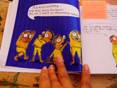
The blues didn’t come out as I expected and Nupur had mentioned this to me. For the next print I will have to re-check all the background colours and a few of the illustration colours with a colour value book. Cheeku looks like he has jaundice in a few spreads.  The colour blue feels a little over powering; I am reconsidering the use of such a strong colour in so many pages.


The flaps should also be better utilised. I spent a lot of time editing the text that would come in them but there are two side to the flap and using both makes more sense in terms of the information I can give as well as visually.


One of the main pull outs came out upside down and I will have to adjust most of my flaps.


There are a lot of changes that I need to make and I suppose better now than later. Will have more inputs from my review panel next week.


In the mean time, I’m going to start working on the collaterals.
·         A twin set of tote bags
·         A  twin set of aprons
·         A set of 6 table mats

Thursday, September 9, 2010

Review 4

Diploma Review 4
Thursday 9th September
Panel: Arathi, Geetu & Nupur

Feedback:
·         The type of paper used for the inside pages should be of a higher GSM- 200+ and you can look into printing on ivory paper rather than white as it will complement the colour palette and the “rough feel” of your illustration style.
·         Also need to think about the shaded of blue used in your layouts as blue prints differently. Will have to be careful about reproducing the shades you want in the final print.
·         Think about alternating the background colours of the pages to help with the reading flow- it shouldn’t get repetitive and “expected”. Also reconsider use of vertical lines and grids in the backgrounds, perhaps use colour textures instead.
·         The body copy type size needs to be a lot larger for children’s books. Also the hand drawn type of the chapter titles need to be refines.
·         The illustrations of the grandfather character are becoming too realistic in certain spreads, should re- look at those.
·         Consider ideas for the cover- perhaps an illustration from the inside pages, it has to be relatable with a child. The title needs to be something fun as well.

Deliverables:
·         Dummy of the book printed on the type of paper discussed in the review today with final illustrations and typography in place by next Friday, 17th September.

Final Illustration & Type Style...